
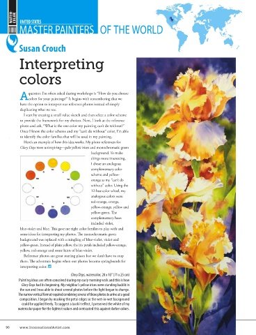
Page 91 - International Artist 110
P. 91
STAGE 7 DECISIONS ABOUT THE BACKGROUND
        Before I started the painting, I envisaged a black background. The
        main colours in the mix you see here are cadmium red and Winsor
        blue, and I tried a little quinacridone gold in the top right-hand corner
        to see if it would work. As I’m building up the tones I’m not sure about
        my decision, and I’m thinking, “That’s quite nice.” I’m using my bigger
        flat brushes loaded with wet colour but the mask around the edges
        keeps the white paper safe. I’ve also applied light glazes of the same
        colours to the neck and chest to harmonise the painting.

        ABOUT THE ARTIST
                                               STAGE 8
        Kristine Nason is a leading contemporary equestrian artist based in the U.K.
        Following a successful career at the business end of art, Nason rediscovered   DARKENING AND CONTINUING TO BUILD
        her passion for painting when her children were small. She works in pencil,   Black wins out in the end. It’s certainly not a flat black, as different
        watercolour, oil and acrylic, creating freely expressive pieces as well as   colours from the layers work to make the final image vibrate. I’m
        detailed and insightful portraits using horses as her primary subject matter.   playing with the push and pull of warm and cool colour glazes on
        She has been elected to full membership of both the Society of Equestrian   Delfin, and I’m picking out individual hairs and flecks on his coat with
        Artists and the Society of Women Artists.  my No. 10 round brush and with coloured pencils.
         With collectors throughout the world, her work is regularly selected for   With the background done I’ve removed mask from the whiskers
        major art exhibitions. She has won many awards and has been featured in top   and all edges. I use a scrubber (cat’s tongue) brush to clean up any
        national and international art publications.  small bleeds of paint, and soften the whiskers with washes of paint.
         Nason’s work is respected for its anatomical accuracy, movement and
        portrayal of the character of each subject. Her mission statement is to create   Where lines are untidy or too thick I’ll refine them with glazes of local
        artworks that delight the eye and touch the soul.  colour on the muzzle and opaque black over the background.
        Contact at         Find me on
        www.kristinenason.com  /KristineNasonFineArt


   88     www.InternationalArtist.com
   88

   KristineNason.indd   88                                                        6/22/16   11:17 AM