Page 18 - International Artist 110
P. 18
Finalist


        Paul McCloskey  Wexford, Ireland, THE OMEGA – At last my thoughts lay silent, oil, 30 x 30 cm (12 x 12")
        Finalist

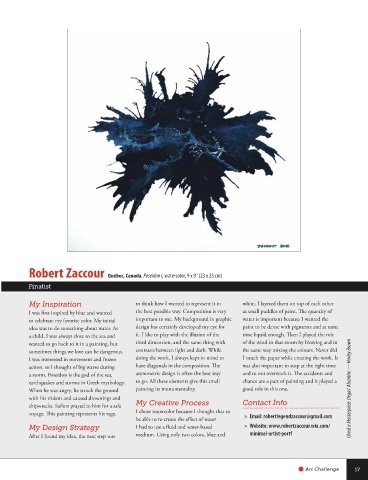
        My Inspiration            The suggestion of heaven and earth in   all things in all directions at once.
        My visual influence is determined by the   constant struggle, merging yet separable,
        surrounding landscape, but its intention is   solid yet amorphous all suggest the   My Working Process
        primarily as a catalyst in expressing divinity   multidimensional nature of the spiritual,   I am an intuitive painter; I see painting
        and is therefore secondary to this expression,   the beginning and the end, the alpha and   as an act of allowing; process is primary
        the primary purpose being process, allowing,   omega, the struggle within, between the   for me. In order to be truly whole, open
        presence and place.       conditioned self and the divine/spiritual self.     and susceptible, one must first be present.
         The varied and stunning Irish landscape,           Everything happens in the present moment.
        coupled with our unsettled weather and,   My Design Strategy  True art can only be created from this
        therefore, often fleeting and mottled light,   My most recent paintings The Omega   place, and only from this place of being
        inspires me greatly. Often a view will   (awakenings 3d) build on my previous series   can anything be truly of merit. So by the
        change or an area will be illuminated by a   Awakenings (The Alpha) and Awakenings   silencing of the mind, getting out of my
        simple break in the clouds, highlighting as   Reloaded. This is the third in the trilogy of the   own way and through the act of allowing
        if a shimmering treasure or jewel, a corner   awakenings theme. They consist of 15 cubes, a   divinity/creativity to work through me,   At least once a week, draw something different. —Harley Brown
        of a field, the side of some rocky cliff or   number of which are wall-mounted and some   I give consent for that creativity to manifest.
        the dynamic sweeping curves of a valley   of which allow the viewer a full 360-degree   Contact Info
        reminding us that we are an integral part of   view of the works. The cubes question and
        and connected to a whole. Effectively, this   challenge the staple of painting being confined     »  Email: paulmccloskey35@gmail.com
        encourages us to see and, most importantly,   to the two-dimensional surface, pushing the
        feel its beauty and spirit therefore   boundaries into the third dimension. The     »  Website: www.paulmccloskey.ie
        reconnecting to this vital part of us.   cubes suggest the dichotomy of spirit, being     »  Instagram: @paul_mccloskey_art


                                                                           Art Challenge  15


   Challenge Winners 110.indd   15                                                6/29/16   4:03 PM

